‘I do’ was not a moment but a place we’ve built on truth ...
September 8, 2026
What to Wear for Family Photos
MORE LIKE THIS
STYLE GUIDE
September 8, 2026
What to Wear for Family Photos
A timeless, convenient guide to dressing your family for portraits you’ll love for years to come.
Family photos should feel like your family—not a perfectly coordinated catalog shoot.
The best images happen when everyone feels comfortable, confident, and like themselves. But I also know that choosing what everyone should wear can feel like the hardest part of preparing for your session.
So, here’s my simple approach to getting a classic cohesive look without dressing everyone in matching outfits.
Start With One Outfit You Love

Instead of trying to coordinate everyone at once, start with one person.
I usually recommend choosing Mom’s outfit first because it can establish the overall color palette, texture, and level of formality for the rest of the family.
Once you have one outfit you love, build everyone else’s wardrobe around it.
One anchor outfit
Complementary colors
Varied textures
Cohesive overall look
This is much easier than trying to find five identical shades of beige.
Choose a Color Palette, Not Matching Outfits
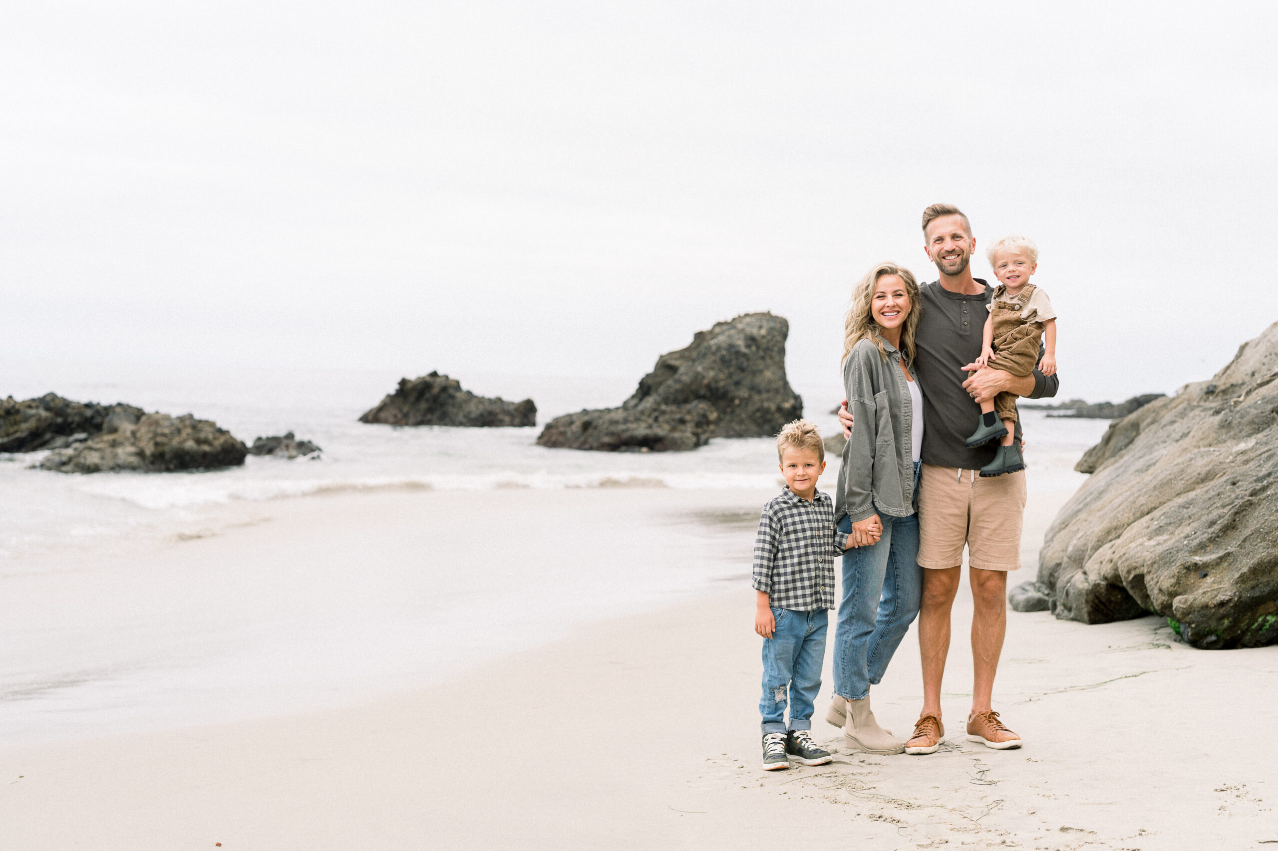
The goal isn’t for everyone to wear the same color.
In fact, I generally recommend avoiding it.
Instead, choose 3–5 colors that work beautifully together.
Some combinations I love:
Cream + tan + soft blue + denim
White + oatmeal + olive + brown
Soft neutrals + muted sage + warm terracotta
Navy + ivory + camel + denim
Sand + blush + cream + warm brown
You want the colors to feel like they belong together without looking overly coordinated.
A good rule: Coordinate. Don’t match.
Neutrals Are Your Friend

When you’re investing in professional family portraits, timeless usually wins.
Cream, ivory, oatmeal, tan, camel, soft gray, muted blues, olive, and warm browns photograph beautifully and tend to age well.
That doesn’t mean everyone needs to wear beige.
A neutral palette simply gives your photographs a quieter visual foundation so the focus stays where it belongs: on your family.
And if you love color, absolutely use it. Just consider choosing softer, more muted versions rather than having several competing bright colors.
Add Texture

One of the easiest ways to make a coordinated wardrobe feel elevated is through texture.
Think:
Linen
Knitwear
Cotton
Wool
Denim
Corduroy
Gauze
Silk
Suede
Light layers
For example, Dad might wear a linen button-down, Mom a flowing textured dress, and the kids a combination of cotton, knit, and denim.
The colors can be simple because the textures create visual interest.
Think About Movement
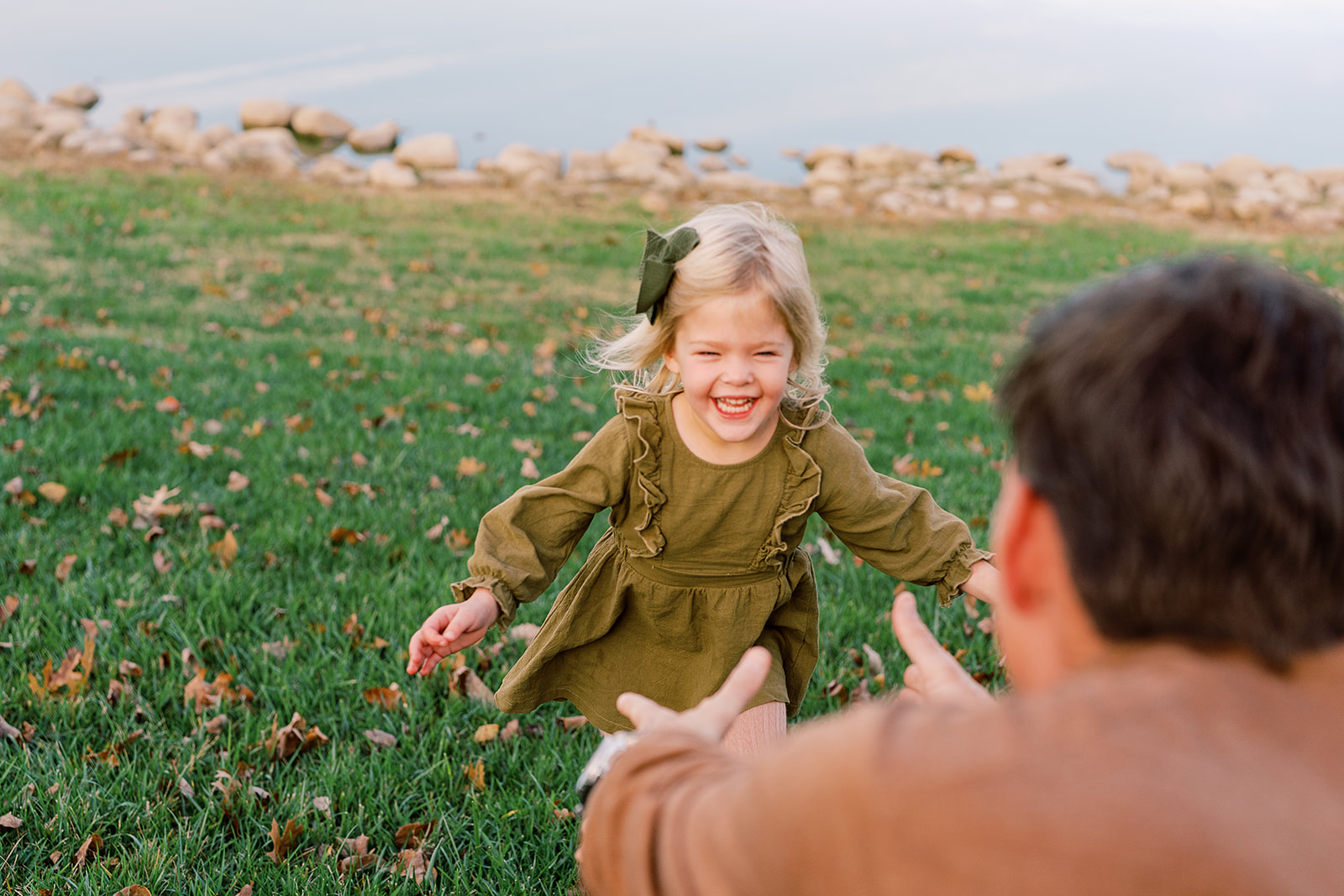
This is especially important with little kids.
Your family isn’t going to stand perfectly still for an hour—and that’s a good thing.
I want to photograph the movement, connection, laughter, cuddling, and little in-between moments that actually feel like your family.
So choose clothing that allows you to move.
Flowy dresses, relaxed button-downs, soft sweaters, and comfortable trousers tend to photograph beautifully because they move naturally with you.
Avoid anything that feels restrictive or requires constant adjusting.
Consider the Location
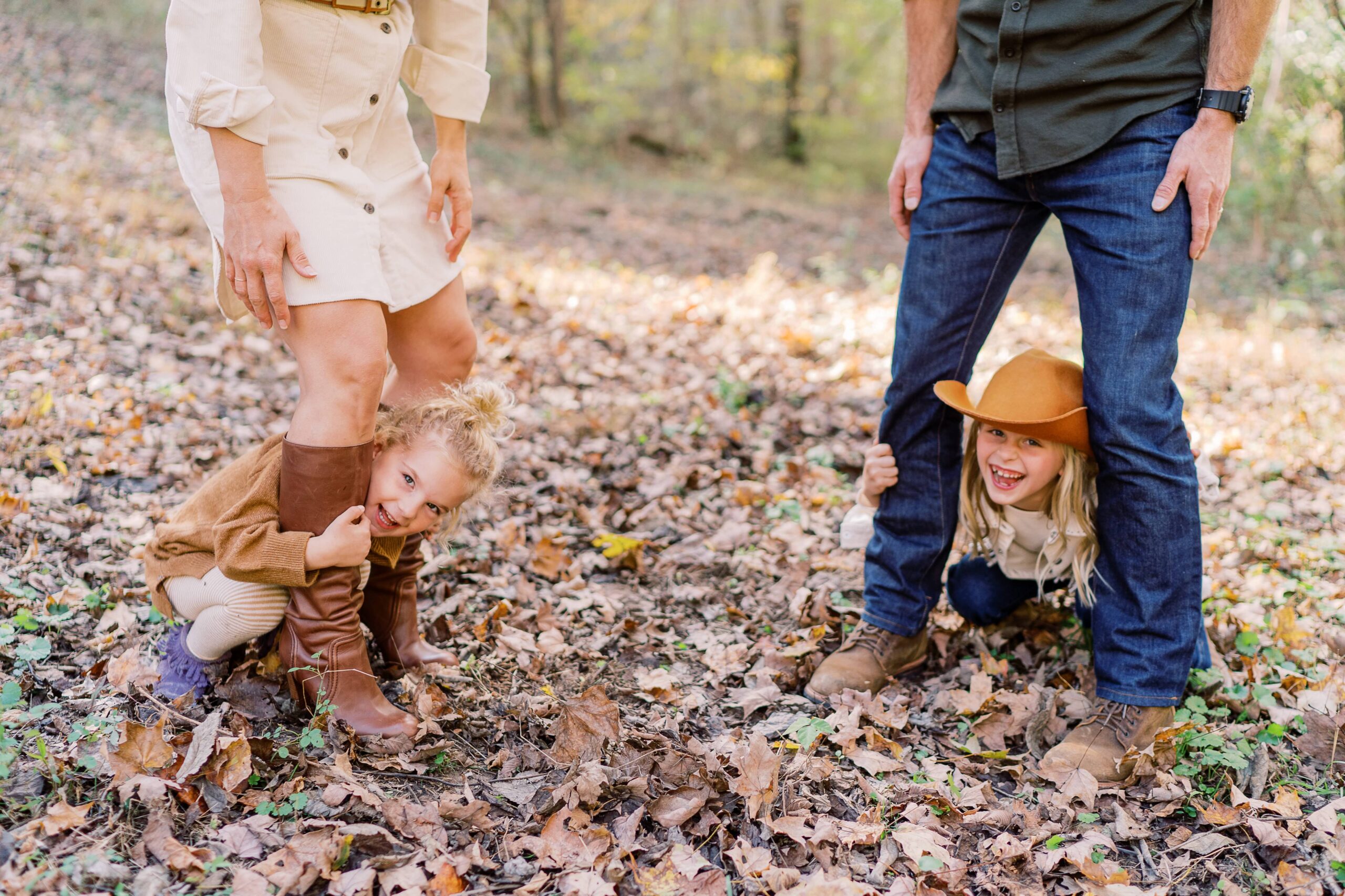
Your outfits should make sense with where we’re photographing.
For a beach session, you might lean toward:
Ivory + linen + soft blue + tan
For a grassy field or garden:
Cream + olive + warm brown + muted neutrals
For an urban setting:
Black + cream + denim + camel
The location is part of the visual story, so I like the wardrobe to complement—not compete with—the environment.
Don’t Forget the Shoes
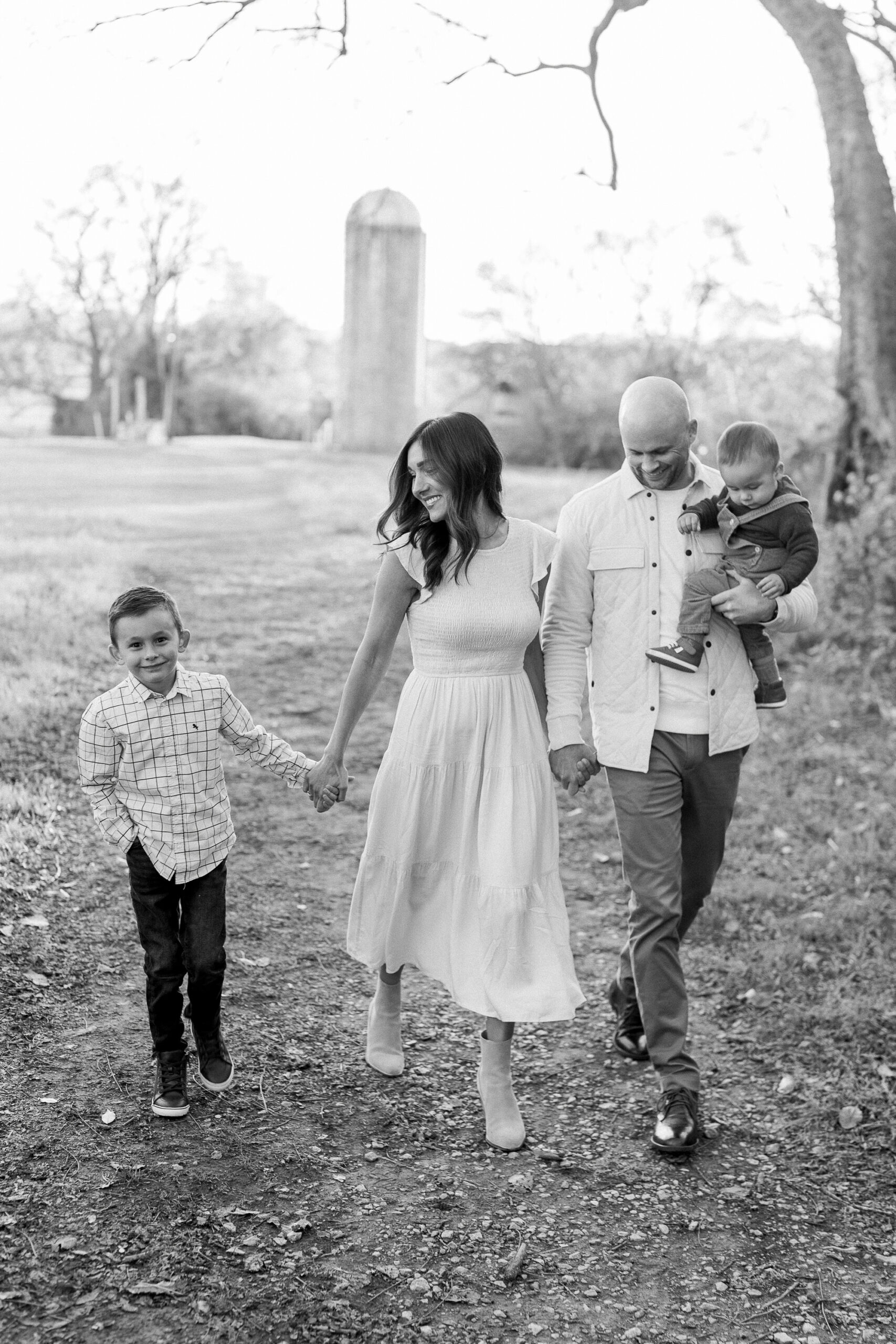
Shoes are often the last thing people think about, but they can completely change the feel of an image.
For a more timeless look, consider:
Simple leather sandals
Loafers
Neutral boots
Ballet flats
Minimal sneakers
Bare feet for a relaxed beach or home session
Try to avoid shoes with large logos, neon colors, or anything that feels visually disconnected from the rest of the wardrobe.
And yes—sometimes taking the shoes off is the best choice.
What About Patterns?

Patterns aren’t off-limits.
I actually love a good subtle pattern.
The key is balance.
If one person is wearing a patterned dress, let the rest of the family wear mostly solids and subtle textures.
Try to avoid having multiple people in competing patterns.
Small florals, subtle stripes, classic checks, and understated prints tend to work beautifully.
A Few Things I’d Skip
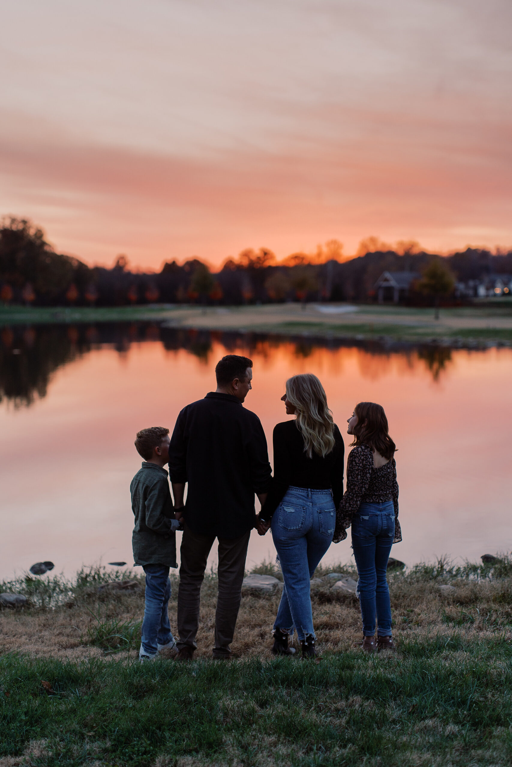
There are a few wardrobe choices that can make photographs feel more dated or visually distracting.
I’d generally avoid:
Everyone wearing the exact same color
Everyone wearing the same outfit style
Large logos or graphics
Neon or extremely saturated colors
Very small, busy patterns
Clothing that requires constant adjusting
Trendy pieces that don’t feel like you
Anything your child absolutely hates wearing
That last one matters more than you might think.
A beautifully styled outfit isn’t worth a miserable toddler.
The Most Important Rule: Dress Like Yourselves
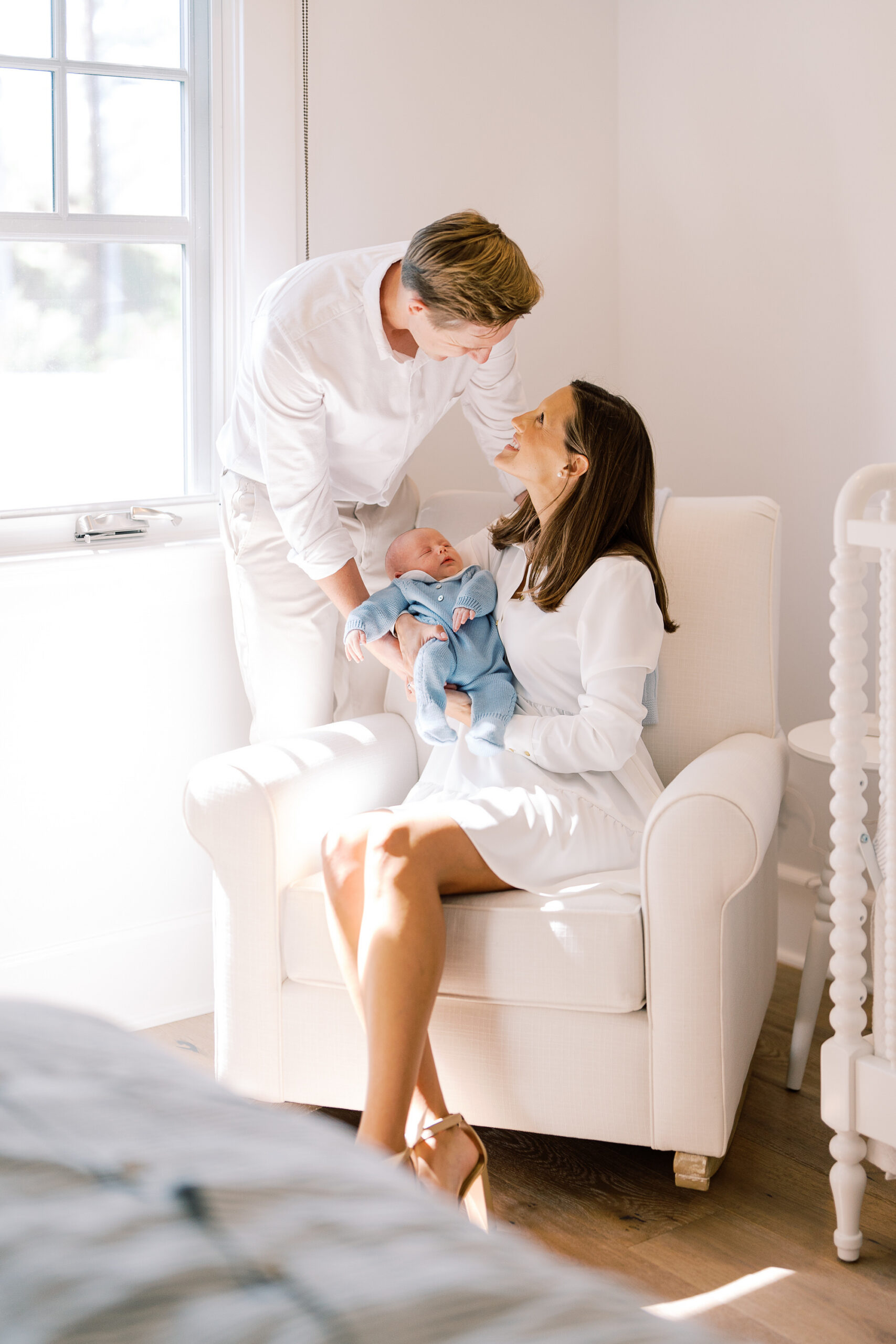
Your family portraits don’t need to look like someone else’s Pinterest board.
If you never wear dresses, don’t suddenly put on a formal gown.
Or your family lives in jeans and button-downs, lean into that.
Maybe you love fashion, have fun with it.
The goal is to create photographs that feel beautiful today and still feel like you ten, twenty, or thirty years from now.
Because these aren’t really photographs about what you wore.
They’re photographs about who you were together.
And that’s what I want you to remember.
My Simple Family Photo Formula

If you’re completely overwhelmed, start here:
1. Choose one anchor outfit.
Pick the person whose outfit establishes the overall style.
2. Build a soft color palette.
Choose 3–5 complementary colors.
3. Mix textures.
Linen, cotton, denim, knits, wool, and other natural textures add depth.
4. Keep patterns limited.
One subtle pattern can be beautiful. Five competing patterns probably won’t be.
5. Prioritize movement and comfort.
Especially for little ones.
6. Coordinate—don’t match.
And finally…
Wear something that makes you feel good.
When you feel comfortable in what you’re wearing, it shows.
And that’s always more beautiful than perfectly coordinated outfits.


comments +